

This latest post is related to CSS in which i will add filter to some images purely using CSS. Lez get into it.
We'll first see the markup write below and will see the output pics one by one. You'll also get the CodePen link. 😁
Adding filter to images in CSS
- Open you code editor and be ready with the pic.
<div>
  <h1>Original Image:</h1>
<img src="https://s3-us-west-2.amazonaws.com/s.cdpn.io/29841/dog.jpg">
</div>

<div class="filt1">
  <h1>Filtered Image:</h1>
<img src="https://s3-us-west-2.amazonaws.com/s.cdpn.io/29841/dog.jpg">
</div>
<br>
<div class="filt2">
  <h1>Filtered Image:</h1>
<img src="https://s3-us-west-2.amazonaws.com/s.cdpn.io/29841/dog.jpg">
</div>
<br>
<div class="filt3">
  <h1>Filtered Image:</h1>
<img src="https://s3-us-west-2.amazonaws.com/s.cdpn.io/29841/dog.jpg">
</div>
nd finally the CSS
img {
  display: block;
  max-width: 100%;

}
.filt1{
   filter: grayscale(90%) sepia(13%) saturate(700%);
}
.filt2{
  filter: hue-rotate(-40deg);
}
.filt3{
  filter: contrast(170%) saturate(80%)
}
Lez see the output
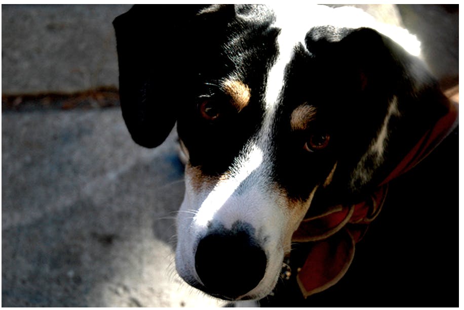
So first basic image was this
- Basic image
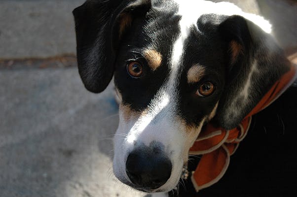 This was the real pic we've added filter to this pic.
- Saturated
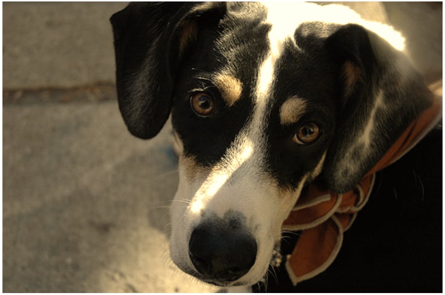
filter: grayscale(90%) sepia(13%) saturate(700%);
- BnW
filter: hue-rotate(-40deg);
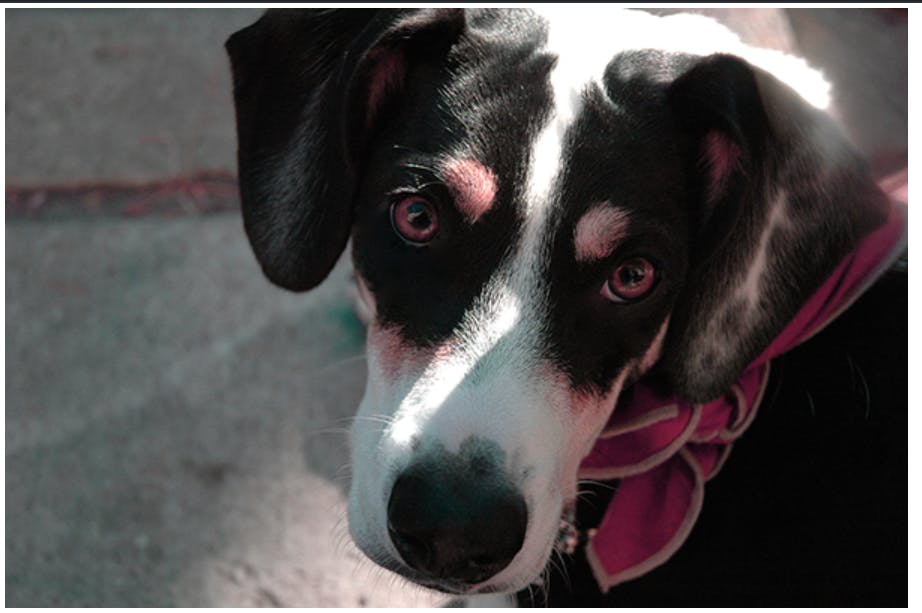
- Sharp 😂
filter: hue-rotate(-40deg);
To use CodePen => codepen.io/rahxuls/pen/YzqoPbx
Thanks for seeing this tutorial. Hope you like it. If you have anything going in your mind comment down below. 😎