A brief guide to Animations in CSS

Don't be afraid of animation. They're easy. This small started guide will help you in creating 4 simple type of keyframe animations.
Keyframes
You can use CSS keyframes to create some cool animation by transitioning between CSS properties. This quick intro to keyframe animation will cover the animation properties and show you five simple examples.
Animation Properties
To apply keyframe animations to your element you need to use the animation properties. Think of these as the setting for the animation.
.animated-element {
  /*The name of the animation keyframes */
  animation-name: rotate;
  /*How long the animation should be*/
  animation-duration: 0.5s;
  /*How many times should it play*/
  animation-iteration-count: infinite;
  /*Anyd elay before the animation starts*/
  animation-delay: 1s;
  /*Specifies the speed curve of the animation*/
  animation-timing-function: ease-in-out;
}
Animation keyframes
You also need to create the keyframes. An animation has timeline (0-100) and you can set a keyframe at any point in the timeline to change the look of the element using any CSS property. To code will then work out the frames in between and leave you with a smooth animation.
@keyframes animation-name{
    /*start*/
    0% {
      width: 0;
    }
    /*end*/
    100% {
      width: 50%;
    }
Scale
.animation--rotate {
      animation-name: rotate:
      animation-duration: 6s;
      animation-iteration-count: infinite;
      animation-timing-function: ease-in-out;
    }
    @keyframe rotate {
    0% {
       transform: rotate(0deg);
    }
    50% {
       transform: rotate(360deg);
    }
    100% {
       transform: rotate(0deg);
    }
  }
Translate
.animation--translate {
    animation-name: translate;
    animation-duration: 2s;
    animation-iteration-count: infinite;
    animation-timing-function: linear;
}

@keyframes translate {
    0% {
        transform: translate(0, -50%);
    }
    25% {
        transform: translate(0, 50%);
    }
    50% {
        transform: translate(-50, 0);
    }
    75% {
        transform: translate(-50%, 0);
    }
    100% {
        transform: translate(0, -50%);
    }
}
Fade
.animation--fade {
    animation:fade;
    animation-duration: 4s;
    animation-iteration-count: infinite:
    animation-timing-function: ease-in-out;
}

@keyframes fade {
    0% {
        opacity: 1;
    }
    80% {
        opacity: 0;
    }
    100% {
        opacity: 1;
    }
}
Thanks for Reading | Happy Animating 🚀
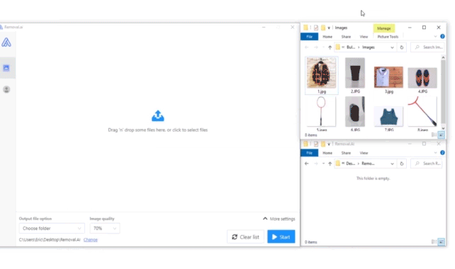
Removal.AI - [SPONSOR]
Remove background from multiple images in a single upload straight to your desktop using Bulk Photo Background Remover for Windows.
- ✅ Drag & Drop Multiple Images
- ✅ Optimize Product Images
- ✅ Select Your Background
- ✅ Set Your Output Size
- ✅ Exceptional Results
Visit -> Removal.AI


